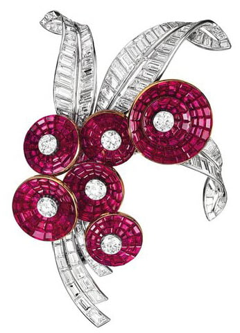
Photography was not permitted, so you'll have to follow the link above to see some samples. (I've hot linked the images below - please tell me if any of them don't work.)
The main exhibition, occupying the whole display area on the main (entry level) floor, is called "Set in Style: the Jewelry of Van Cleef & Arpels". This focuses on the magnificent items created by this firm, founded by two brothers-in-law in 1896. The jewelry equivalent of haute couture, the pieces are exquisite, if rather de trop (~too much) for my tastes. Nonetheless, it was much more interesting than I expected, and there were a few designs, methods and pieces that really qualified as examples of "design".
Unfortunately, the layout of the exhibits left a lot to be desired. There were a very few pieces around the outside of each room, with most of the pieces, perhaps 70 or so per room, jammed into a single display case in the middle of the room. With the descriptions and curatorial notes in the booklet given to you at admission, there were lots of not-moving people peering into the long glass domes, making it bloody hard to see anything. That, together with the aggressively protective staff, who would sternly tell you not to lean on the tables or touch the dome or do anything that might afford a slightly better view.

The exhibition itself was divided into six sections, matching the six rooms. The first, titled Innovation, showed in a video their patented "Mystery Set" construction method. This is how the designers can make planes of jewel-cut stones sit completely flush with one another, with no visible setting except around the perimeter. The manufacturing method spares no expense, from finding the huge number of stones that exactly match in hue, to the ten-year apprenticeship for the people who polish the settings, to the precision cutting and grinding of the stones that wears away half of each stone.

The second gallery, entitled Transformations, shows the ingeniousness behind some of the designs. Many of the pieces can be worn in different ways. The Walska brooch, for example, can transform from the brooch shown below: the pendant in the bird's mouth can be detached an hung from a chain; the wings can come off to become earrings (clip-ons); the tail comes off and can be worn separately as a brooch.

The other particularly ingenious piece in this display is the zip necklace.

The centre section (around the back of the neck) unclips, and the two remaining sections simply zip up, creating a very beautiful bracelet. Again, there was a video in the exhibition showing this in action.
There were also several pretty bangles with small watch faces hidden under a jewelled lid. (I can't readily find an example online).
The third gallery was called "Nature as Inspiration", with various pieces fashioned as bunches of flowers, birds on a wire, snowflakes, butterflies, and the more frivolous mushrooms, poodles, scarecrows and cowboys.

Next was the "Exoticism" section, with various themes evoking Egyptian, Japanese, Chinese, Siamese, Cambodian, Persian and other countries.
Some pieces worked better than others.
In the same room, was the "Fashion" section, which didn't do much for me either. It certainly showed that rather than retain a classical beauty, they very often followed trends.
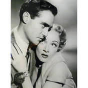
Finally, there was a room called "Personalities" where they showed pieces being worn by various celebrities and socialites and, often, the pieces themselves. So there was Marlene Dietrich's Jarretiere bracelet, and Grace Kelly's engagement set (necklace, bracelet, pair of earrings and ring) and Elizabeth Taylor's lamartine bracelet and earrings, among many others.


There are plenty of articles and blogs about if you're interested in seeing more.
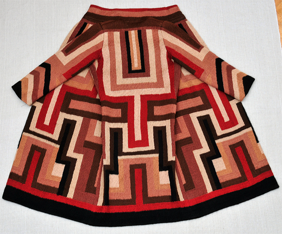
Upstairs was an exhibit highlighting the work of Sonia Delauney, who was a true multi-media artist. However, she was best-known for, and the exhibit mainly focuses on, her textile designs. I wish they'd had more of her garments - all they had was one coat (of which I'm rather covetous) and a few pairs of togs (the original tankinis).

(They had this pice on a mannequin rather than on a wall, so you could see how beautifully it hung. It was made for Gloria Swanson.)
Again, lots of glorious pictures if you search under Sonia Delaunay online.
No comments:
Post a Comment